Caseworker Dashboard
The MijnOmgeving caseworker dashboard is the primary interface for municipality staff. It is a shell-based single-page application that loads at /dashboard/caseworker and remains publicly accessible — authentication is handled inside the component rather than at the route level, allowing unauthenticated visitors to browse public content before logging in.
Shell layout
The dashboard is divided into three permanent zones:
┌─────────────────────────────────────────────────────────────────────┐
│  Top navigation bar (header)                                        │
│  MijnOmgeving  [Home] [Persoonlijke info] [Projecten]               │
│                [Gereedschap] [Audit log]                      User  │
├──────────────┬──────────────────────────────────────────────────────┤
│ Left panel   │                                                      │
│ (w-56)       │  Main content area                                   │
│              │                                                      │
│ Section nav  │  Rendered by renderContent()                         │
│              │  based on activeSection                              │
└──────────────┴──────────────────────────────────────────────────────┘
Tenant vs Platform
Tenant-configured pages (Home, Persoonlijke info, Projecten) are driven by tenants.json. Platform-scoped pages (Gereedschap, Audit log) are hardcoded in CaseworkerDashboard.tsx — they always appear for authenticated users regardless of tenant.
Top navigation bar
The header contains three top-level navigation pages and a user block on the right:
| Page ID | Label | Default first section | Scope |
|---|---|---|---|
home |
Home | Nieuws | Tenant-configured (tenants.json) |
personal-info |
Persoonlijke info | Profiel | Tenant-configured (tenants.json) |
projects |
Projecten | Taken | Tenant-configured (tenants.json) |
gereedschap |
Gereedschap | Gereedschap (overview) | Platform-scoped — all authenticated users |
audit-log |
Audit log | Overzicht | Platform-scoped — admin role required |
The three tenant-configured pages show or hide entirely based on whether the tenant's leftPanelSections contains at least one section for that page. Pages with no accessible sections for the current user are filtered out of the top nav automatically.
When tasks are pending, the page button for Projecten shows a count badge (tasks.length) so caseworkers can see open work at a glance without navigating there first.
The user block shows:
preferred_usernamefrom the JWT (set via Keycloakusername→preferred_usernameprotocol mapper)- LoA badge (
loaclaim, e.g.hoog) - One badge per role in
realm_access.roles(e.g.caseworker,hr-medewerker) - Uitloggen button when authenticated, or an Inloggen als medewerker button when not
Left panel
The left panel is driven entirely by tenantConfig.leftPanelSections[activeTopNavPage] — an array of section objects configured per tenant in public/tenants.json. Switching the top-nav page swaps the entire left-panel contents. Each section object has the shape:
The isPublic flag controls whether the section is accessible without authentication (see Public and private sections below).
The active section is highlighted using the tenant's primary colour (--color-primary). Clicking a section stores the choice in sectionMemory so returning to the same top-nav page restores the last visited section rather than defaulting to the first.
Main content area
The main area renders the component for activeSection. Each section ID maps to a dedicated render function:
| Section ID | Component | Auth required |
|---|---|---|
nieuws |
<NieuwsSection /> |
No |
berichten |
<BerichtenSection /> |
No |
producten-diensten |
<ProductenDienstenCatalogus /> |
No |
regelcatalogus |
<RegelCatalogus /> |
No |
procesbibliotheek |
<ProcesBibliotheek /> |
No |
taken |
<TakenSection /> |
Yes |
archief |
<ArchiefSection /> |
Yes |
profiel |
<ProfielSection /> |
Yes |
rollen |
<RollenSection /> |
Yes |
hr-onboarding |
<HrOnboardingSection /> |
Yes + hr-medewerker role |
onboarding-archief |
<OnboardingArchiefSection /> |
Yes + hr-medewerker role |
rip-fase1 |
<RipFase1Section /> |
Yes + infra-projectteam role |
rip-fase1-wip |
<RipFase1WipSection /> |
Yes + infra-projectteam role |
rip-fase1-gereed |
<RipFase1GereedSection /> |
Yes + infra-projectteam role |
gereedschap-overzicht |
<GereedschapSection /> |
Yes (platform-scoped) |
mcp-chat |
<McpChatSection /> |
Yes — caseworker role (platform-scoped) |
audit-overzicht |
<AuditSection activeTab="overzicht"> |
Yes + admin role (platform-scoped) |
audit-details |
<AuditSection activeTab="details"> |
Yes + admin role (platform-scoped) |
All components live in src/components/CaseworkerDashboard/ (from v2.9.2). The platform-scoped entries (gereedschap-overzicht, audit-overzicht, audit-details) are never present in any tenant's leftPanelSections — they use dedicated section constant arrays hardcoded in CaseworkerDashboard.tsx.
Sections not yet implemented render a placeholder card ("Deze sectie is in ontwikkeling.").
Public and private sections
The dashboard is accessible without login. Whether a section renders its content or a login prompt depends on the isPublic field in tenants.json:
isPublic: true— content renders for all visitors, authenticated or not.isPublic: false— an unauthenticated visitor clicking the section sees a login prompt instead of the content. No redirect occurs; the user remains on the page.
When an unauthenticated visitor lands on the dashboard and navigates to a top-nav page whose first section is private, the dashboard selects the first public section for that page automatically, avoiding an empty content area.
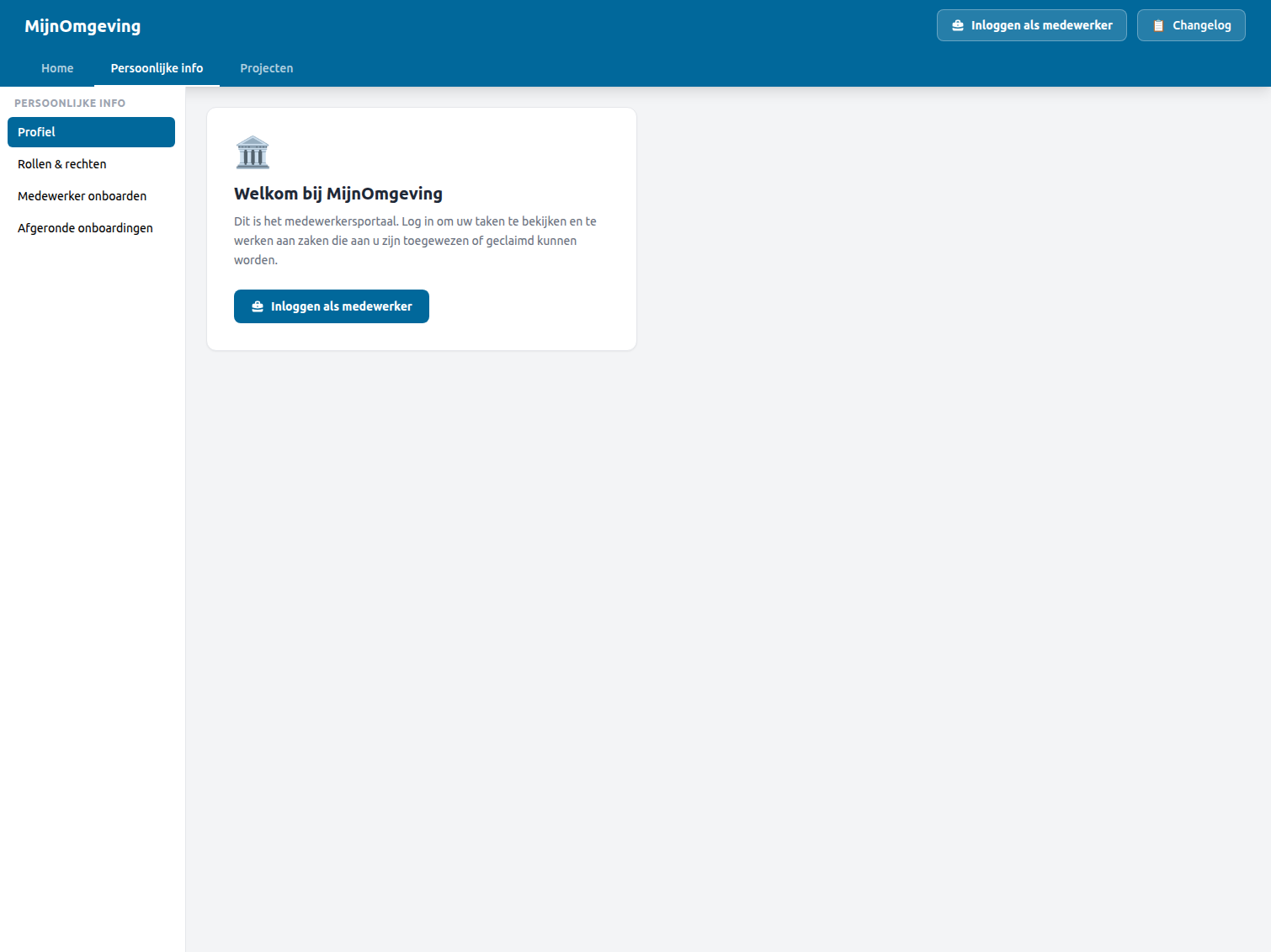
Clicking Inloggen als medewerker in the prompt stores medewerker in sessionStorage and navigates to /auth, following the same caseworker login path described in Logging In.
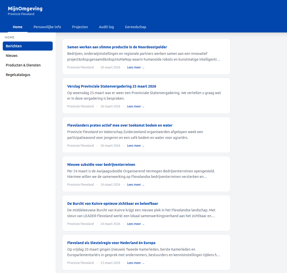
Home tab
The Home tab contains three public sections, all visible without authentication.
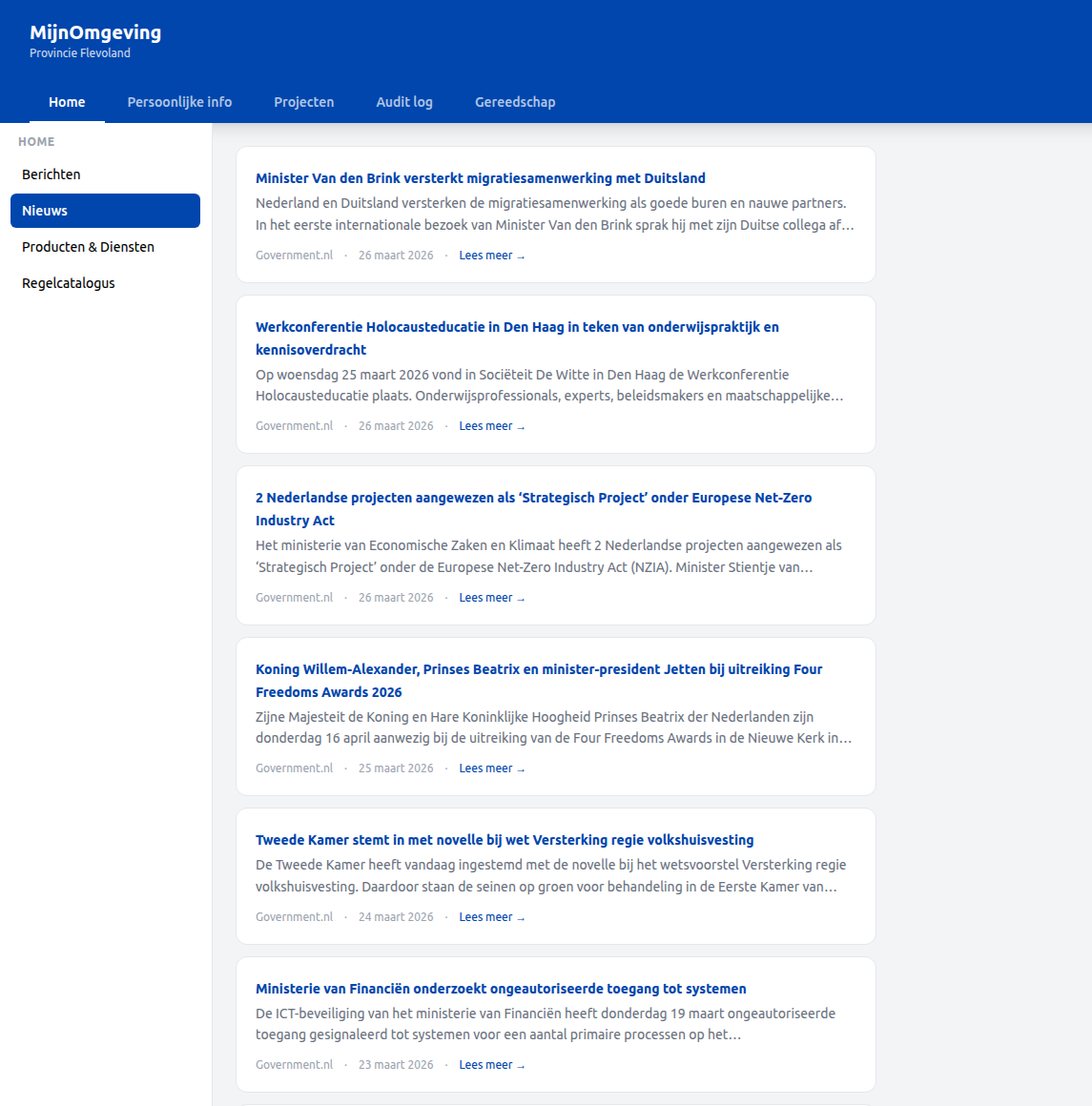
Nieuws
Fetches the latest government news from the Rijksoverheid RSS feed via GET /v1/public/nieuws. Items are shown as expandable cards with title, publication date, and stripped body text. The feed is cached for 10 minutes on the backend; on cache failure the stale result is returned to prevent a blank UI.
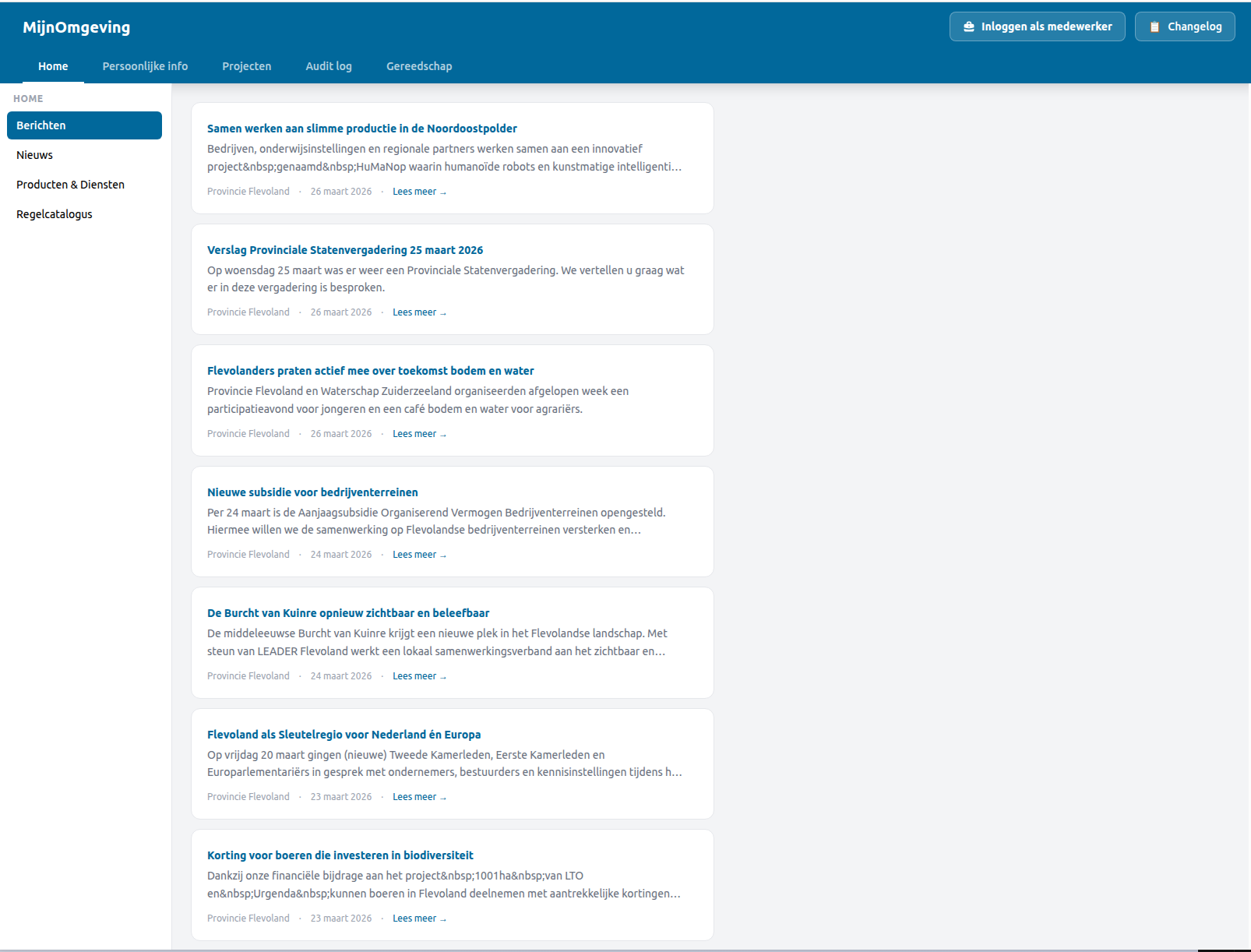
Berichten
BerichtenSection is a self-contained component that fetches and renders announcements from GET /v1/public/berichten. It owns its own fetch lifecycle and requires no props beyond being mounted.
The data source changed in v2.9.3 from a hardcoded seed array to the live Provincie Flevoland RSS feed. From the frontend perspective the contract is unchanged — the component consumes the same BerichtItem shape it always did.
Each card in the list shows the subject, preview, priority badge, and publication date. When item.action is present, a Lees meer → anchor is rendered in the card footer, linking directly to the source article on flevoland.nl. This mirrors the pattern used by NieuwsSection.
The section is registered as { id: "berichten", label: "Berichten", isPublic: true } in leftPanelSections.home for all tenants in tenants.json, and appears above nieuws.
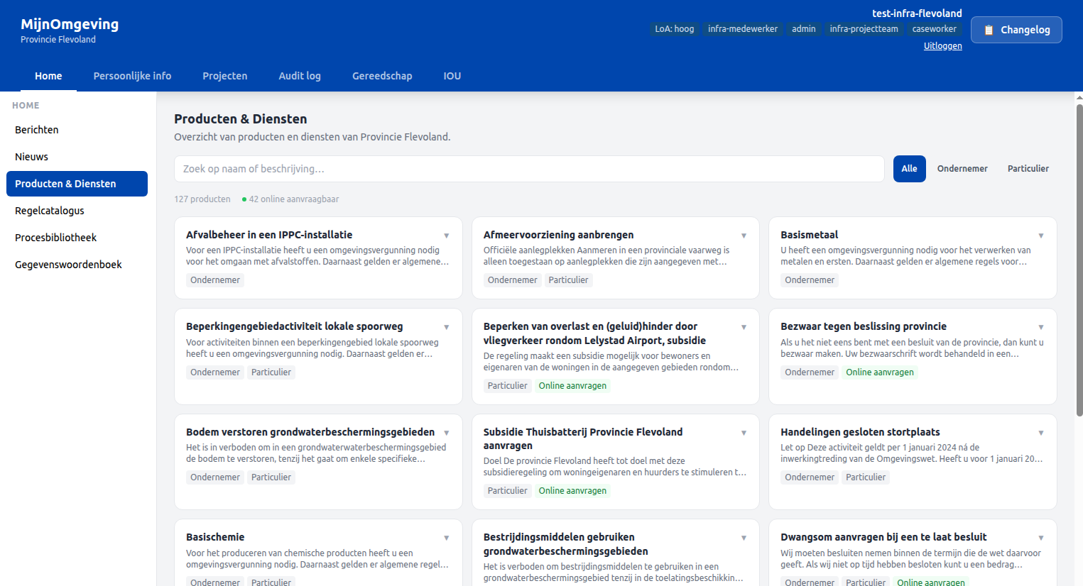
Producten & Diensten Catalogus
ProductenDienstenCatalogus is a self-contained component that fetches GET /v1/public/producten-diensten and renders the Provincie Flevoland SC4.0 product feed as an expandable card grid. The section is only configured in the Flevoland tenant's leftPanelSections.home in tenants.json. It is publicly accessible — no login required.
Layout. Products are displayed in a 2-column card grid, styled after RegelCatalogus. Each card shows the product title and audience badges (Ondernemer, Particulier). An Online aanvragen badge appears on products where onlineAanvragen is true. Expanding a card reveals the full description and a link to the product page on flevoland.nl.
Filtering. A free-text search field and an audience filter (Alle / Ondernemer / Particulier) are rendered above the grid. Both filters operate client-side on the full cached dataset.
Stats row. A summary row above the grid shows the total number of visible products and the count of items with online aanvraag enabled.
To add this section to another tenant, add the following entry to that tenant's leftPanelSections.home in public/tenants.json:
The backend service (productenDiensten.service.ts) currently hard-codes the Flevoland SC4.0 feed URL. Serving a different feed for a different tenant would require extending the service to accept a tenant parameter.
Regelcatalogus
Displays the RONL knowledge graph via GET /v1/public/regelcatalogus. See Regelcatalogus for the full feature description.
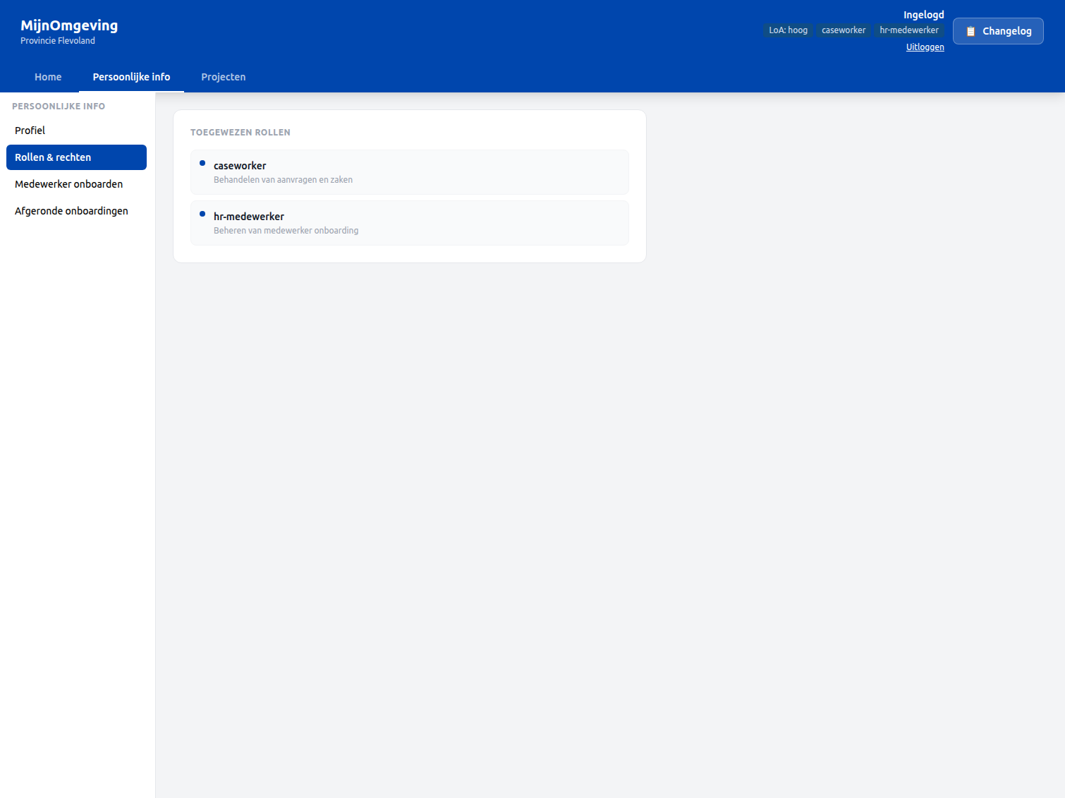
Persoonlijke info tab
The Persoonlijke info tab exposes four left-panel sections, all requiring authentication. See HR Onboarding Workflow for a full walkthrough of each section.
| Section | Accessible to |
|---|---|
| Profiel | All caseworkers |
| Rollen & rechten | All caseworkers |
| Medewerker onboarden | hr-medewerker role only |
| Afgeronde onboardingen | hr-medewerker role only |
Projecten tab
The Projecten tab contains the task queue and, for tenants with active BPMN processes, dedicated project management sections. The sections shown depend on the tenant configuration in public/tenants.json.
The Flevoland province tenant exposes the following sections:
| Section | Accessible to | Description |
|---|---|---|
| Taken | All caseworkers | Full task queue with claim and complete |
| RIP Fase 1 starten | infra-projectteam |
Start a new RipPhase1Process instance |
| RIP Fase 1 WIP | infra-projectteam |
Browse active RIP Phase 1 projects and their documents |
| RIP Fase 1 gereed | infra-projectteam |
Browse completed RIP Phase 1 projects and their documents |
| Actieve zaken | All caseworkers | Placeholder |
| Archief | All caseworkers | Placeholder |
See Caseworker Workflow for the task queue and RIP Phase 1 Workflow for the full RIP process walkthrough.
Tenant configuration
Each tenant defines its own left-panel section lists in public/tenants.json. This means different organisation types (municipality, province, national) can expose a different set of sections without any code change:
"leftPanelSections": {
  "home": [
    { "id": "nieuws",             "label": "Nieuws",                "isPublic": true  },
    { "id": "berichten",          "label": "Berichten",             "isPublic": true  },
    { "id": "producten-diensten", "label": "Producten & Diensten",  "isPublic": true  },
    { "id": "regelcatalogus",     "label": "Regelcatalogus",        "isPublic": true  }
  ],
  "personal-info": [
    { "id": "profiel",             "label": "Profiel",                 "isPublic": false },
    { "id": "rollen",              "label": "Rollen & rechten",        "isPublic": false },
    { "id": "hr-onboarding",       "label": "Medewerker onboarden",    "isPublic": false },
    { "id": "onboarding-archief",  "label": "Afgeronde onboardingen",  "isPublic": false }
  ],
  "projects": [
    { "id": "taken",           "label": "Taken",              "isPublic": false },
    { "id": "rip-fase1",       "label": "RIP Fase 1 starten", "isPublic": false },
    { "id": "rip-fase1-wip",   "label": "RIP Fase 1 WIP",     "isPublic": false },
    { "id": "rip-fase1-gereed","label": "RIP Fase 1 gereed",  "isPublic": false },
    { "id": "actief",          "label": "Actieve zaken",      "isPublic": false },
    { "id": "archief",         "label": "Archief",            "isPublic": false }
  ]
}
To add a new section, add an entry here and implement the corresponding case in renderContent() in CaseworkerDashboard.tsx. The RIP sections are Flevoland-specific — other tenants omit them entirely from their tenants.json.
Tenant-scoped vs platform-scoped features
Not all dashboard features are controlled by tenants.json. There are two distinct categories:
Tenant-scoped features are configured per organisation in tenants.json via leftPanelSections. They vary between tenants — a section present for Flevoland may be absent for Utrecht. Adding or removing a tenant-scoped feature requires only a tenants.json change; no code is touched.
Platform-scoped features are hardcoded in CaseworkerDashboard.tsx and apply across all tenants. They are not controlled by organisation — instead, visibility is gated by role. A platform-scoped feature is either present for all tenants (if the user holds the required role) or absent for all tenants (if they do not).
The audit log is the primary example of a platform-scoped feature. It is not listed in any tenant's leftPanelSections, it shows cross-tenant data, and its visibility is governed by the admin role — not by organisation.
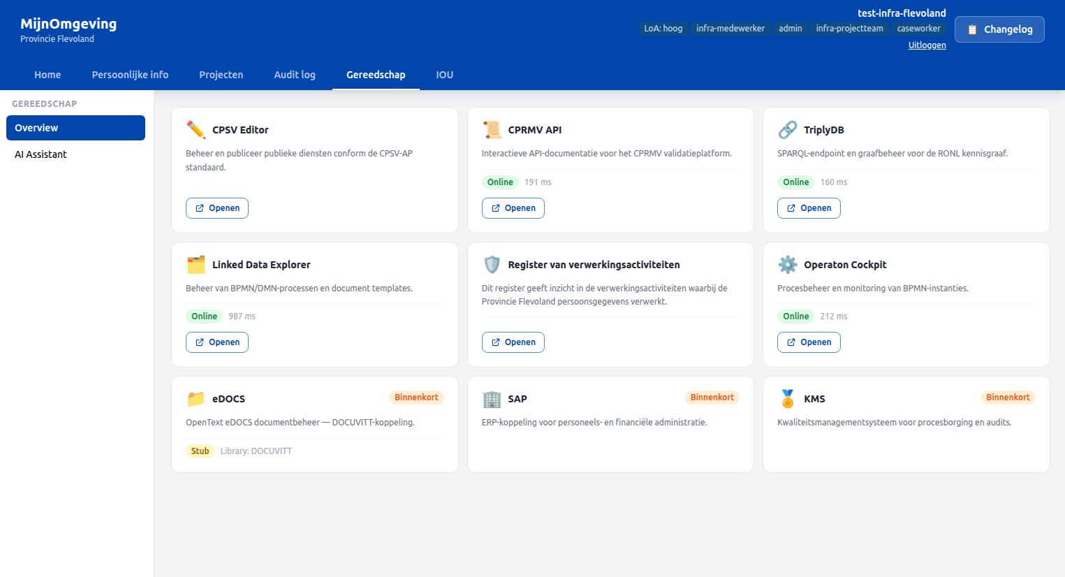
The Gereedschap tab is a second example. It is also not in tenants.json — it is a fixed top-nav page available to all authenticated caseworkers regardless of organisation. It provides a central hub for platform tools (LDE, TriplyDB, CPSV Editor, CPRMV API, Operaton Cockpit, eDOCS, SAP, KMS), each as a tool card. Active tools open in a new tab; placeholder tools (eDOCS, SAP, KMS) show an orange Binnenkort badge instead. Live status widgets for Operaton, eDOCS, CPRMV API, TriplyDB, and LDE are fetched on mount — eDOCS and Operaton via existing endpoints, the three external tools via GET /v1/health/external (server-side HEAD requests to avoid CORS). Operaton Cockpit and SAP are only visible to users with the admin role. Adding a new tool requires a single entry in the PLATFORM_TOOLS constant in GereedschapSection.tsx.
Two further features follow the same pattern: the Changelog button in the top navigation bar and top navigation filtering (which hides top-nav pages that have no accessible sections for the current user). Both are rendered unconditionally in CaseworkerDashboard.tsx and are unaffected by tenant configuration.
The practical rule when adding new dashboard functionality: if the feature is organisation-specific, add it to tenants.json and implement the corresponding case in renderContent(). If the feature is cross-tenant and role-gated, add it directly to CaseworkerDashboard.tsx without touching tenants.json.
Platform-scoped vs tenant-scoped sections
Not all top-nav tabs in the caseworker dashboard are equal. The dashboard distinguishes two categories:
Tenant-scoped sections are driven entirely by tenants.json. The leftPanelSections object per tenant defines which sections appear under home, personal-info, and projects. Adding or removing a section for a specific organisation requires only a change to tenants.json — no code changes are needed. This makes it safe to roll out features incrementally per organisation type.
Platform-scoped sections are hardcoded in CaseworkerDashboard.tsx and are identical for all tenants. They are gated by role or authentication state, not by organisation. The canonical examples are the audit-log and gereedschap tabs.
| Tab | Type | Gating |
|---|---|---|
| Home | Tenant-scoped | Defined in tenants.json → leftPanelSections.home |
| Persoonlijke info | Tenant-scoped | Defined in tenants.json → leftPanelSections.personal-info |
| Projecten | Tenant-scoped | Defined in tenants.json → leftPanelSections.projects |
| Audit log | Platform-scoped | Visible to all authenticated users; non-admin users see a Toegang beperkt screen. Gated by the admin Keycloak realm role, not by organisation |
| Gereedschap | Platform-scoped | Visible to all authenticated caseworkers. Individual tools within the overview are role-gated (Operaton Cockpit and SAP require admin) |
| IOU | Tenant-scoped (tenant opt-in) | Defined in tenants.json → leftPanelSections.iou; currently only enabled for flevoland |
The Changelog button in the top navigation bar and the top-nav filtering (e.g. showing only the tabs applicable to the current tenant) follow the same platform-scoped pattern — they are hardcoded in CaseworkerDashboard.tsx and are not configurable per tenant.
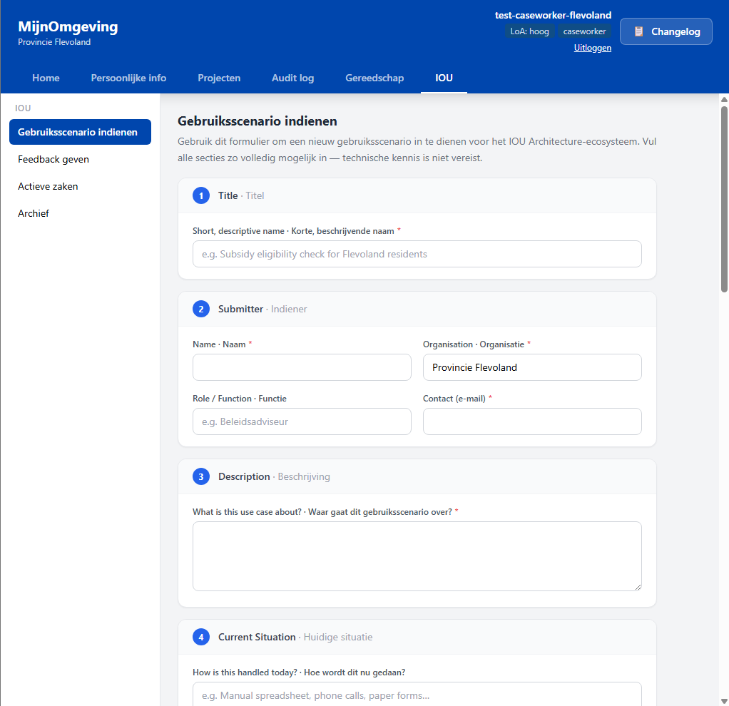
IOU tab (Provincie Flevoland)
The IOU tab is a tenant-scoped top-nav tab currently enabled only for the flevoland tenant. It provides a lightweight project-management interface over the IOU Architecture GitLab repository and contains four sections:
| Section ID | Label | Auth required | Description |
|---|---|---|---|
iou-gebruiksscenario |
Gebruiksscenario indienen | Yes | 10-section submission form that creates a GitLab issue via POST /v1/public/use-case. Organisation is pre-filled as "Provincie Flevoland". |
iou-feedback |
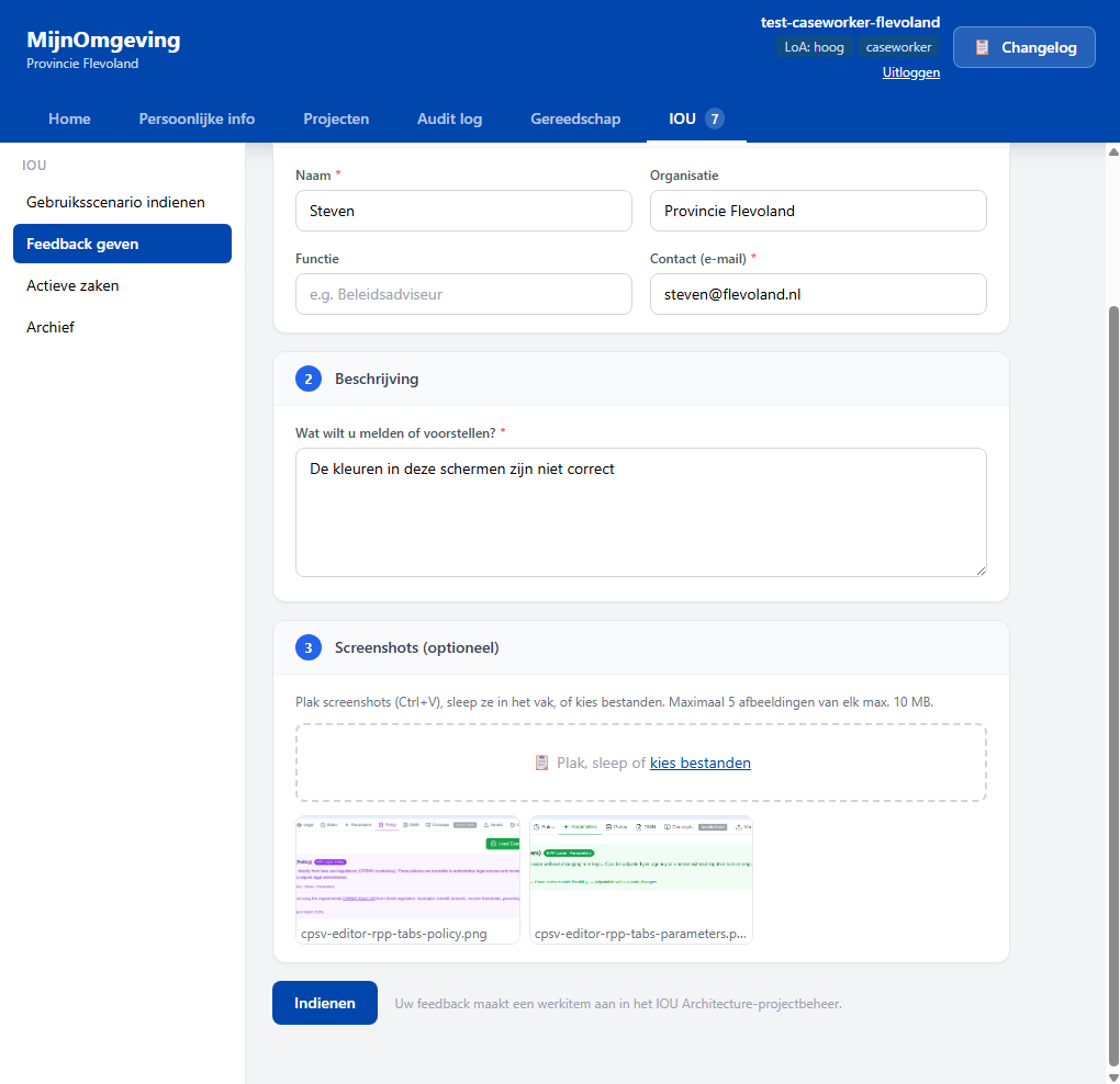
Feedback geven | Yes | Feedback form with optional screenshot upload (up to 5 images, 10 MB each). Backend uploads images to the GitLab project uploads API and embeds them in the issue body via POST /v1/public/feedback. |
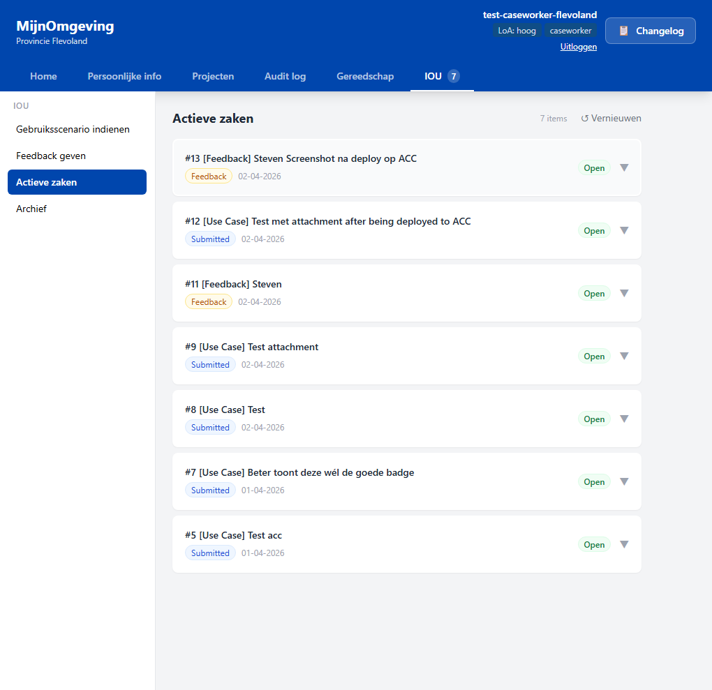
iou-actieve-zaken |
Actieve zaken | No (public) | Read-only list of open GitLab issues fetched from GET /v1/public/use-cases?state=opened. Cards are rendered with react-markdown + remark-gfm. |
iou-archief |
Archief | No (public) | Same component as Actieve zaken with state=closed. |
The IOU tab is enabled in tenants.json by adding an iou key to leftPanelSections for the relevant tenant. Removing or commenting out the iou key for a tenant hides the tab entirely without any code change.
Backend dependencies
The IOU tab depends on three environment variables that must be set on the backend:
| Variable | Description |
|---|---|
GITLAB_TOKEN |
Personal access token with api scope for git.open-regels.nl |
GITLAB_BASE_URL |
GitLab instance base URL (default: https://git.open-regels.nl) |
GITLAB_PROJECT_PATH |
URL-encoded project path (e.g. showcases%2Fiou-architectuur) |
GITLAB_UC_LABEL |
Label applied to newly created use-case issues (e.g. Submitted) |
Related documentation
- Caseworker Workflow — Task queue, claim, complete, AWB Kapvergunning, Archief
- HR Onboarding Workflow — Persoonlijke info sections in detail
- RIP Phase 1 Workflow — Projecten tab RIP sections in detail
- Regelcatalogus — Knowledge graph browser
- Multi-Tenant Municipality Portal — Tenant theming and isolation
- Frontend Development — CaseworkerDashboard.tsx architecture